Slopegraphs in R with ggplot2 Information density is up and to the right
Slopegraphs have seen some recent attention on Edward Tufte's forum
and in the data visualization community, especially Charlie Park's
excellent treatment of them. In this post, I make a simple slopegraph
using less than 20 lines of R and ggplot2.
Slopegraphs are very simple—there is no (as ET says) chartjunk.
There are examples of making slopegraphs in ggplot (http://www.jameskeirstead.ca/blog/slopegraphs-in-r/, http://www.r-bloggers.com/slopegraphs-in-r-2/, https://github.com/bobthecat/codebox/blob/master/table.graph.r) all over the web, but what's the web if it doesn't have one more example?
Plus, mine is simple—less than 20 lines of R code if you don't include the initialization of the data.
Load the libraries
I obviously need the ggplot2 library, otherwise I would be lying
in the title. I also load the scales library so I can label the
points nicely by putting commas in the numbers.
library(ggplot2)
library(scales)
Load the data
Likely you'll load the data from a file into a data frame, and it doesn't matter too much what it looks like, as long as each row has the start value, the end value, and the label somewhere in it. Or it could be three different variables in other places.
You'll also need a variable for the x-axis. In my case, this is 24
months (see: months<-24)
months<-24
year1<-c(1338229205,5212325386,31725112511)
year3<-c(1372425378,8836570075,49574919628)
group<-c("Group C", "Group B", "Group A")
a<-data.frame(year1,year3,group)
Set the arrays of labels
This makes the strings we'll use for the labels by combining the
group name with the value at each end of our slope line.
I also use the comma_format()() function from the scales
library here to make slightly cleaner looking labels.
If you prefered a more Tufte-esque label, you can omit the newline
from the sep= option and flip the order of the second set of
labels.
l11<-paste(a$group,comma_format()(round(a$year1/(3600*24*30.5))),sep="\n")
l13<-paste(a$group,comma_format()(round(a$year3/(3600*24*30.5))),sep="\n")
Draw the slopelines
This line is pretty simple but draws the slopelines using the
geom_segment where the x-range is 0 to months and the y-range
is from the a data frame values.
p<-ggplot(a) + geom_segment(aes(x=0,xend=months,y=year1,yend=year3),size=.75)
Set the theme to be nothingness
These settings turn off all of the default ggplot2 decorations
(chartjunk?).
p<-p + theme(panel.background = element_blank())
p<-p + theme(panel.grid=element_blank())
p<-p + theme(axis.ticks=element_blank())
p<-p + theme(axis.text=element_blank())
p<-p + theme(panel.border=element_blank())
Set the axis labels and limits
The x label is empty because we'll use the column headings to
denote the time span (or whatever x-range you have), the y label is
still useful, though, although the theme_text(vjust=X) moves the
label a little closer—you'll want to play with this for your own
plot until it looks correct to you.
Also, I make the plot area a little bigger by setting xlim and
ylim to be bigger than the data would imply. This is also a bit
of art, so you'll want to look at this for your own chart, too.
p<-p + xlab("") + ylab("Amount Used")
p<-p + theme(axis.title.y=theme_text(vjust=3))
p<-p + xlim((0-12),(months+12))
p<-p + ylim(0,(1.2*(max(a$year3,a$year1))))
Label the slopelines
Here we use the labels we created above in the geom_text()
function, once for each side of the slopeline. The first line
below is for the right side (year3) of the chart and the second
is for the left side (year1).
The rep.int command that sets x just repeats the
number—either 0 or 24—to make the same number of elements
in x as there are in y.
Again, the hjust and size parameters will need some attention
to get your slopegraph to look just right.
p<-p + geom_text(label=l13, y=a$year3, x=rep.int(months,length(a)),hjust=-0.2,size=3.5)
p<-p + geom_text(label=l11, y=a$year1, x=rep.int( 0,length(a)),hjust=1.2,size=3.5)
Label the columns
The columns titles, or labels at the top of each side of the
slopegraph, are set here using geom_text() and setting y to
just a bit above the maximum value from the two lists of values
(year1 and year2). Don't forget to pay attention to hjust
and size again.
p<-p + geom_text(label="Year 1", x=0,     y=(1.1*(max(a$year3,a$year1))),hjust= 1.2,size=5)
p<-p + geom_text(label="Year 3", x=months,y=(1.1*(max(a$year3,a$year1))),hjust=-0.1,size=5)
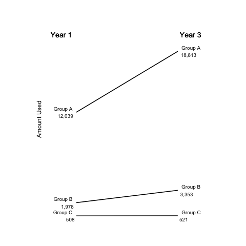
Finally, some graphics
In the end, this R code produces this figure:
The entire script, suitable for copying-and-pasting is here
library(ggplot2)
library(scales)
months<-24
year1<-c(1338229205,5212325386,31725112511)
year3<-c(1372425378,8836570075,49574919628)
group<-c("Group C", "Group B", "Group A")
a<-data.frame(year1,year3,group)
l11<-paste(a$group,comma_format()(round(a$year1/(3600*24*30.5))),sep="\n")
l13<-paste(a$group,comma_format()(round(a$year3/(3600*24*30.5))),sep="\n")
p<-ggplot(a) + geom_segment(aes(x=0,xend=months,y=year1,yend=year3),size=.75)
p<-p + theme(panel.background = element_blank())
p<-p + theme(panel.grid=element_blank())
p<-p + theme(axis.ticks=element_blank())
p<-p + theme(axis.text=element_blank())
p<-p + theme(panel.border=element_blank())
p<-p + xlab("") + ylab("Amount Used")
p<-p + theme(axis.title.y=theme_text(vjust=3))
p<-p + xlim((0-12),(months+12))
p<-p + ylim(0,(1.2*(max(a$year3,a$year1))))
p<-p + geom_text(label=l13, y=a$year3, x=rep.int(months,length(a)),hjust=-0.2,size=3.5)
p<-p + geom_text(label=l11, y=a$year1, x=rep.int( 0,length(a)),hjust=1.2,size=3.5)
p<-p + geom_text(label="Year 1", x=0,     y=(1.1*(max(a$year3,a$year1))),hjust= 1.2,size=5)
p<-p + geom_text(label="Year 3", x=months,y=(1.1*(max(a$year3,a$year1))),hjust=-0.1,size=5)
p