Running in the Heat good thing I live where it is almost always too cold to breathe
This month (February, 2015) I had the very good fortune to be able to spend 5 days in San Juan, Puerto Rico, and I went for a run there each of the 5 days. Part of the reason this was good fortune is that my home town of Ann Arbor, Michigan is in the depths of some really cold weather, although I had recently run 5 days there, too. The running in San Juan seemed much more difficult, which I attributed to the heat. I thought I’d look at my average heart rate over the runs and see if there was anything noticeable.
1 Getting the Data
I use RunKeeper (http://www.runkeeper.com) to track most of my fitness activities, and they offer the most excellent feature of allowing you to export your data.
To download your runs, log in to RunKeeper, click the settings gears in the upper-right corner, and on the left-hand list of options you’ll see “Export Data”, choose your date range and click the “Export Data” button. After a few seconds or minutes you’ll get a button that says “Download Now!”, click it and you’ll get a Zip file of your data; the XML GPX files that this Python script reads and a few CSV files with summary data.
I picked dates that let me make Table 1, and then I did a little arithmetic by hand to come up with some average paces for each location (Table 2).
| Date | Time | Location | Pace |
|---|---|---|---|
| 2015-01-31 | 13:00 | AA | 8:12 |
| 2015-02-03 | 15:27 | AA | 8:33 |
| 2015-02-07 | 14:16 | AA | 8:07 |
| 2015-02-08 | 13:32 | AA | 8:09 |
| 2015-02-10 | 14:48 | AA | 8:34 |
| 2015-02-15 | 10:58 | SJ | 8:35 |
| 2015-02-16 | 09:40 | SJ | 9:06 |
| 2015-02-17 | 16:50 | SJ | 8:13 |
| 2015-02-18 | 15:50 | SJ | 8:29 |
| 2015-02-19 | 08:53 | SJ | 8:54 |
| Location | Average Pace (min/mile) |
|---|---|
| Ann Arbor, MI | 8:19 |
| San Juan, PR | 8:39 |
The data I’m interested in, heart rate at each measurement, is embedded in the GPX (GPS Exchange format) files that RunKeeper delivers. A GPX file from RunKeeper looks like:
<?xml version="1.0" encoding="UTF-8"?>
<gpx
  version="1.1"
  creator="RunKeeper - http://www.runkeeper.com"
  xmlns:xsi="http://www.w3.org/2001/XMLSchema-instance"
  xmlns="http://www.topografix.com/GPX/1/1"
  xsi:schemaLocation="http://www.topografix.com/GPX/1/1 http://www.topografix.com/GPX/1/1/gpx.xsd"
  xmlns:gpxtpx="http://www.garmin.com/xmlschemas/TrackPointExtension/v1">
<trk>
  <name><![CDATA[Running 2/19/15 8:53 am]]></name>
  <time>2015-02-19T12:53:06Z</time>
<trkseg>
<trkpt lat="18.441757000" lon="-66.018932000"><ele>9.0</ele><time>2015-02-19T12:53:06Z</time><extensions><gpxtpx:TrackPointExtension><gpxtpx:hr>85</gpxtpx:hr></gpxtpx:TrackPointExtension></extensions></trkpt>
<trkpt lat="18.441755000" lon="-66.018906000"><ele>9.1</ele><time>2015-02-19T12:53:07Z</time><extensions><gpxtpx:TrackPointExtension><gpxtpx:hr>86</gpxtpx:hr></gpxtpx:TrackPointExtension></extensions></trkpt>
<trkpt lat="18.441735000" lon="-66.018741000"><ele>9.2</ele><time>2015-02-19T12:53:13Z</time><extensions><gpxtpx:TrackPointExtension><gpxtpx:hr>90</gpxtpx:hr></gpxtpx:TrackPointExtension></extensions></trkpt>
   [ ... ]
<trkpt lat="18.442442000" lon="-66.018407000"><ele>8.8</ele><time>2015-02-19T13:38:23Z</time><extensions><gpxtpx:TrackPointExtension><gpxtpx:hr>165</gpxtpx:hr></gpxtpx:TrackPointExtension></extensions></trkpt>
</trkseg>
</trk>
</gpx>
and you can see the heart rate data embedded in the gpxtpx XML
name space.
In addition, RunKeeper names the GPX files like
YYYY-MM-DD-HHMM.gpx.
Now that I have a table of run times and some GPX files with heart rate data, the only thing left is to make a plot of it and look for a trend.
2 Looking for trends
Jumping straight to the plot, there is nothing that strongly bears out my theory that I was working harder in the heat.
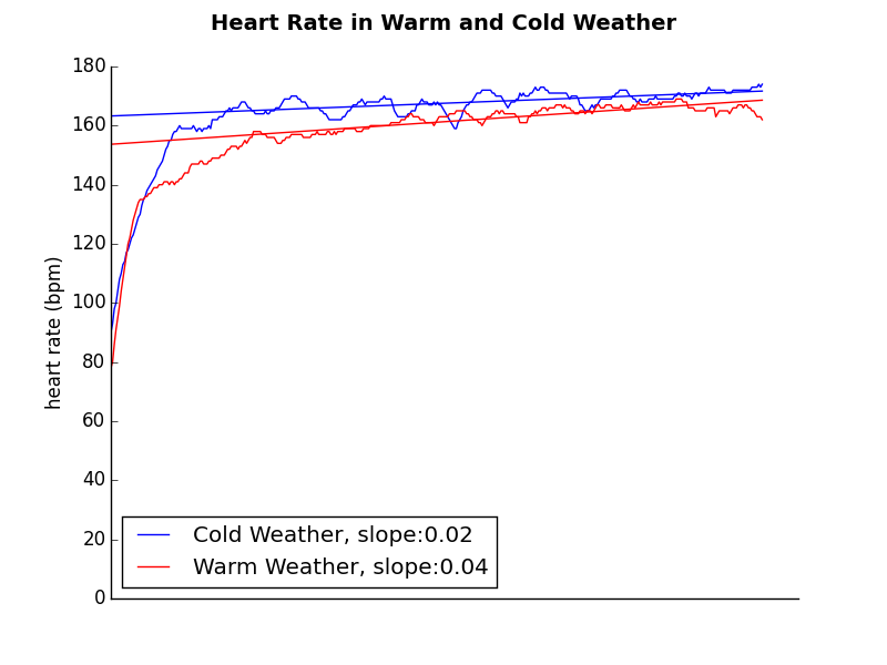
The slope of my heart rate increases slightly faster in the heat, but probably isn’t significant enough given only five samples in each location. My average pace (in Table 2) was a fair bit slower in the heat, so that combined with the faster increase in heart rate looks like the heat has an effect, but it’s not shown as powerfully as I felt it.
3 Conclusions and Next Steps
The heart rate data that wasn’t normalized for pace doesn’t show a terribly powerful effect from the heat. Thinking about heart rate increases over time and pace (or, better, pace over time) in each climate might demonstrate a clearer impact of temperature on my running.
I could try to look at the data again with more factors, but that seems like more work than it’s worth to me.
I think collecting more data would be useful, but I wouldn’t want to do it over a long period of time so I could minimize effects like changes in fitness, injuries, conditions, etc., so I think alternating weeks of running in Ann Arbor and San Juan for the months of January and February is the best way to do this.
4 Python source
The Python program that does this is below; I run it from within Emacs Org mode, so the data in Table 1 is automatically passed in as a variable; you would need to get it from the command line or something if you extracted this script from Org mode.
There are three parts to this program: main, getHRs and plotHRs.
4.1 main
main imports some libraries and does a little data processing but
mostly calls the getHRs and plotHRs routines. It gets back a
Matplotlib fig object and writes it to a file. The return
(filename) is an Org mode thing where it needs to get back the
string of the file name to put insert into itself (yes, it’s weird;
see
http://orgmode.org/worg/org-contrib/babel/languages/ob-doc-python.html
for more information)
4.2 getHRs
getHRs takes the information from Table 1 and turns that
into RunKeeper GPX filenames, reads each file and uses xml.etree
to parse out the heart rate data. It uses the (hard-coded1)
location information from Table 1 to determine whether I was
running in the cold or in the warm, then computes averages2 for each
point.
4.3 plotHRs
plotHRs uses Python’s Matplotlib to plot the heart rate data and
linear fit data computed using NumPy. Basic plotting isn’t
difficult, but all plotting is fussy (although Wilkinson’s Grammer
of Graphics helps, making R’s ggplot2 nicer than Matplotlib, in my
opinion), so there are a bunch of lines of code to make the plot
look OK (and even so…)
4.4 Python Source
def getHRs(runtimes):
    coldHR=[]
    warmHR=[]
    coldTot=[]
    warmTot=[]

    for t in runtimes:             # go through the elements in the table
        # construct the path from the elements in the table
        path = "hr-heat/"+t[0]+"-"+t[1].replace(":","")+".gpx"

        # open the GPX files and parse the XML
        with open(path) as f:
            tree = ElementTree.parse(f)
        # extract the heart rate values from the XML tree into a list
        a = [int(node.text) for node in
             list( tree.iter("{http://www.garmin.com/xmlschemas/TrackPointExtension/v1}hr") )]

        if t[2] == "AA":   # if we're in Ann Arbor where it's cold
            if not coldHR:
                coldHR = a
                coldTot = [1 for m in coldHR]  # make the count '1' for all of the values
            else:
                for m in range(min(len(coldHR),len(a))):
                    coldHR[m] = (coldHR[m] + a[m])
                    if coldTot[m] == None:
                        coldTot[m] = 1  # extend the array (this might not actually work)
                    else:
                        coldTot[m] += 1 # increment the count for averaging later

        elif t[2] == "SJ":  # if we're in San Juan where it's warm, do all the same stuff
            if not warmHR:
                warmHR = a
                warmTot = [1 for m in warmHR]
            else:
                for m in range(min(len(warmHR),len(a))):
                    warmHR[m] = (warmHR[m] + a[m])
                    if warmTot[m] == None:
                        warmTot[m] = 1
                    else:
                        warmTot[m] += 1

        else:    # we don't know where we are
            pass

    # apply all of our averages
    coldHR = [coldHR[m]/coldTot[m] for m in range(len(coldTot))]
    warmHR = [warmHR[m]/warmTot[m] for m in range(len(warmTot))]

    return (warmHR, coldHR)

def plotHRs(HRs):

    cold=[HRs[x][0] for x in range(len(HRs))]
    warm=[HRs[x][1] for x in range(len(HRs))]
    x = range(len(cold))

    fig = plt.figure()
    fig.suptitle("Heart Rate in Warm and Cold Weather", fontsize=14, fontweight='bold')
    ax = plt.subplot(111)
    ax.set_ylim(0,180)  # don't let autoscaling lie with plots
    # turn off a bunch of chartjunk
    ax.set_xticklabels(''*len(x)) # turn off the xticklabels, since they don't mean anything
    ax.spines['top'].set_visible(False)   # turn off top part of box (top spine)
    ax.spines['right'].set_visible(False) # turn off right part of box (right spine)
    ax.yaxis.set_ticks_position('left')   # turn off tick marks on right
    ax.xaxis.set_ticks_position('none')   # turn off tick marks on top and bottom
    # http://matplotlib.org/examples/ticks_and_spines/spines_demo.html
    # http://matplotlib.org/api/axis_api.html

    startSlopeCalc = 75   # heuristically skip the ramp-up period when calculating slope
    mC, bC = np.polyfit(x[startSlopeCalc:], cold[startSlopeCalc:], 1)
    mW, bW = np.polyfit(x[startSlopeCalc:], warm[startSlopeCalc:], 1)

    # overlay the fit lines
    plt.plot(cold,'b',label="Cold Weather, slope:"+str(round(mC,2)))
    plt.plot(warm,'r',label="Warm Weather, slope:"+str(round(mW,2)))

    plt.legend(loc=3) # 3=lower-left (see pydoc matplotlib.pyplot.legend)
    plt.xlabel('')
    plt.ylabel('heart rate (bpm)')

    # generate and plot y-values for fit lines
    yfitC=[x*mC + bC for x in range(len(cold))]
    yfitW=[x*mW + bW for x in range(len(cold))]
    plt.plot(yfitC,'b')
    plt.plot(yfitW,'r')

    return(fig)

if __name__ == "__main__":

    import numpy as np
    import matplotlib
    import matplotlib.pyplot as plt
    from xml.etree import ElementTree

    (w,c) = getHRs(runtimes)
    HRs = zip(c,w)    # put the cold and hot HR lists together, truncating to the shortest

    fig = plotHRs(HRs)
    filename = "assets/running-hr-warm-cold.png"
    fig.savefig(filename, format='png')
    return(filename)
Footnotes:
Because the GPX files have latitude data in them, it wouldn’t be totally difficult to figure this out from the data, but hardcoding it was suitable for me this time.
The points don’t all line up an equal \(\Delta t\) away from each other, but this whole thing is unscientific enough that I don’t think that matters.
- running 3
- heat 1
- heartrate 1
- michigan 3
- puertorico 1
- python 8
- runkeeper 1
- matplotlib 3
- orgmode 1
- gpx 1
- xml 1